The first thing I would like to tell you is the good news. If you are making a truly scrappy quilt with a wide range of colors it is very difficult to go wrong. No one looks at a rainbow and say, “Meh, it’s OK but it would be better with less orange.” The classic scrap quilt and is charming and lovely just as it is.
Now for the even better news, with just a few simple ideas you can add visual interest and appeal to your work. There are multitudes of books, videos, articles, and classes on color theory. I can’t possibly cover everything on this topic in one post but I will try to share some of the things I have found as they relate to scrap quilts. (See my last article for a discussion of value: “Using contrast to add depth to scrap quilts”)

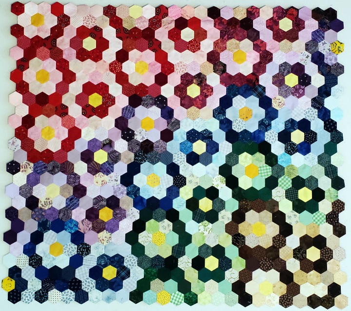
Google a color wheel to see what I will be talking about. You will see that the rainbow has been pulled into a circle. There are all sorts of terms used and I have made quilts highlighting a few of these concepts. For the quilt on the left the colors flow gradually from red to purple, blue, green then brown. I tried putting the colors in clearly defined rows and it looked like a stripy flag. I mentioned in my last article that the eye is drawn to patterns, so it seems almost counter intuitive, but if the color pattern is too obvious, it is less interesting. I think that the irregular transition causes the eye to move and linger a little while longer on the quilt. I also arranged the blocks to create a secondary pattern of light and dark vertical stripes

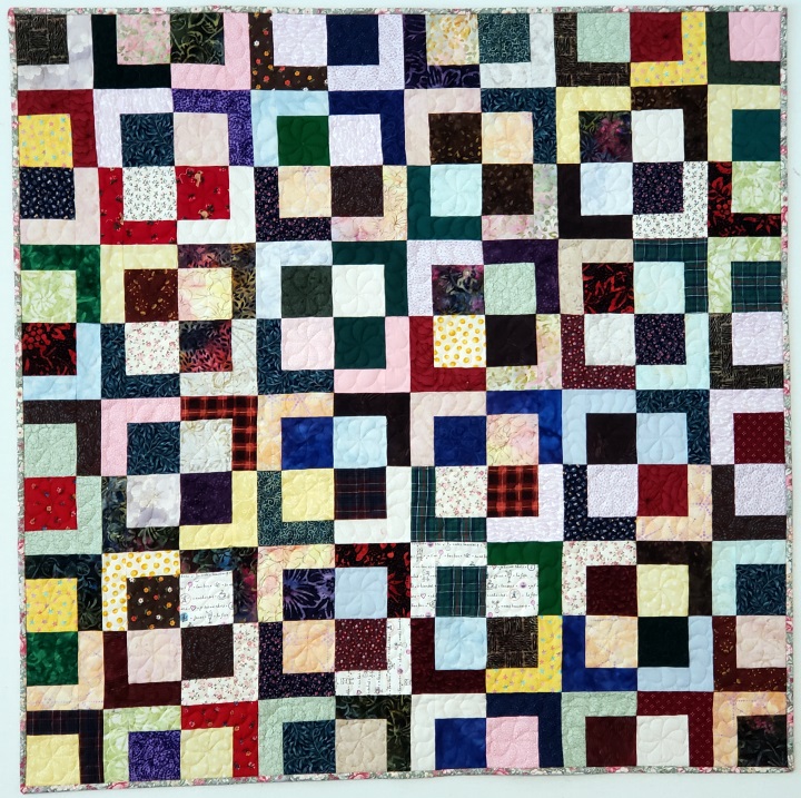
The hexie quilt above has lights and darks of the same colors together. I wanted to expand the pallet, but I wasn’t sure which colors to use. So for the disappearing 4-patch quilt (right), back to the color wheel I went. I saw that colors that are directly across from each other on the wheel are called complementary colors. These colors traditionally go well together. So, red was paired with green, yellow with purple (violet) and brown with, wait, brown isn’t on the rainbow. Well, my color wheel has the tint, tone and shade of each color (more on that later) and it seems that brown is a shade of orange. OK, the complement of brown is blue. I assembled the blocks with their complementary colors and again flowed the colors from one corner to the other.
< id=”#strip”>The next concept I wanted to investigate was analogous colors, the ones that are next to each other on the color wheel. Instead of flowing colors like in the previous two quilts they are mixed together. In this table runner I used blue, blue-green, green and green-yellow strips of scrap fabric.

Here is where I learned a little lesson in tone, tint and shade. A tint is made by adding white to the base color, think pink, or baby blue. A shade is made by adding black to a base color, think brown (for orange) or brick (for orange red), and tones are made by adding gray to the base color. Tint and shade will affect the value of a color, but tone will change how a color feels. The addition of gray makes the fabric look softer and more subdued. I guess that is why we “tone it down”. I looked through my stash as well as my scraps and was amazed at how many are actually tones. Green-gray, (olive, sea foam), blue-gray (coneflower, slate), purple gray, (mauve, orchid) etc. Even though not all of the fabrics above are tones, there are enough of them to give the overall piece a more mellow feel. This doesn’t look bad but wasn’t exactly what I was expecting when I started on the project. It is something that I will definitely keep in mind for future quilts.
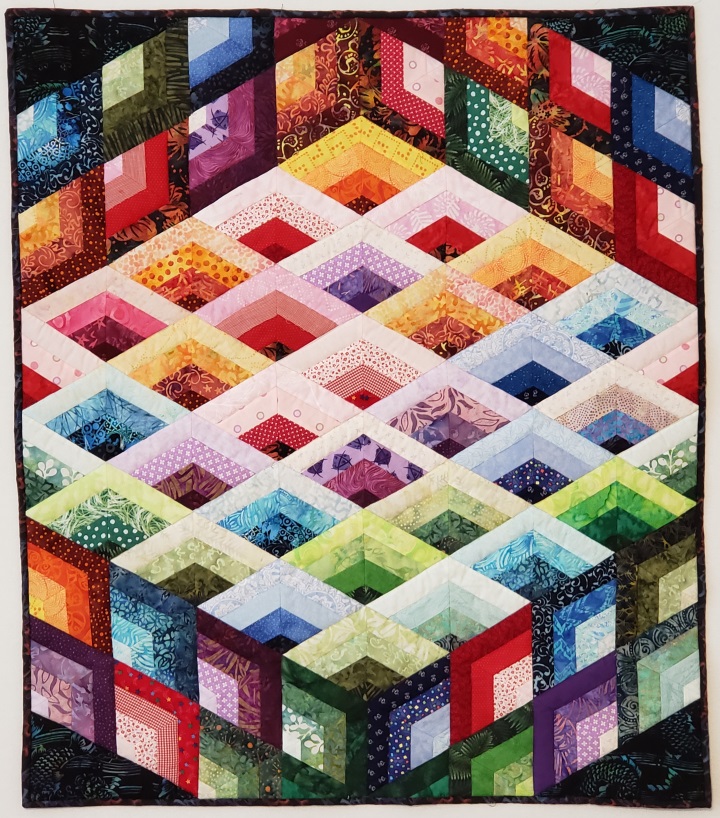
 For the final quilt, I looked at one more color descriptor, temperature. Temperature? That isn’t on the color wheel. Well no, but it is pretty simple. Most sources define the warm colors to be red, orange and yellow. The cool colors are green, blue and purple.
For this quilt I used 1 1/2” scrap strips, with a light, medium-light, medium-dark and dark fabric for each color. I didn’t flow the colors so much as generally grouped the warmer colors toward the top and the cooler colors nearer the bottom. When I tried making the colors flow more evenly as in the second and third quilts above, the colors were the first thing that caught the eye and the affect caused by the different values was diminished. With this layout, the color became the secondary pattern providing additional visual interest, without overwhelming the viewer.
The Pattern for this quilt is available to buy here.
As you can see, there are a lot of fun things you can do with scrap quilts using very simple concepts in color and contrast.
I hope that you liked this, and my previous, articles. I write a new article approximately two months. Please sign up for my newsletter to be alerted when the next article comes out, as well as get additional content. For example, this month’s issue talks bout the painless practice in free motion quilting.

 Color Concepts for Scrap Quilts
It was wonderful getting to see you via zoom at my local quilt quild in October. Did I see a Jacob’s ladder quilt block in that lecture. If I did can I get the information for it.
Thanks,
Kathy
Pingback: Pieces and Patches — February 2023 | Patched Lives Newsletter
Is there somewhere to find a pattern for the variation disappearing four patch shown here made with four inch squares. I think it looks great. I’m a beginning quilter. Thank you.
Pingback: What Am I Supposed to Do With All These Scraps? pt. 1 – The Questioning Quilter
Pingback: Using Contrast to Add Depth to a Scrap Quilt – The Questioning Quilter
Great article! Thanks for sharing.